
Ulcer Index (UI): Complete Guide for Algorithmic Trading
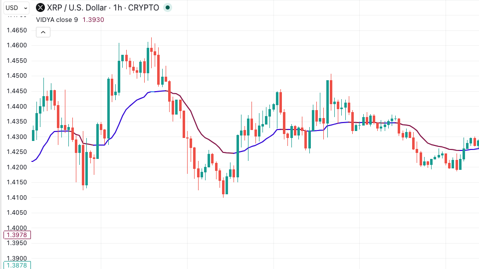
The Ulcer Index (UI) is a risk measurement tool that quantifies the depth and duration of price drawdowns from recent peaks — ignoring upside volatility entirely and focusing only on the downward movement that causes actual losses. Where standard deviation treats a 5% gain and a 5% loss as equally risky, the Ulcer Index treats only the loss as a problem worth measuring.
What Is the Ulcer Index?
The Ulcer Index was developed by Peter Martin and Byron McCann in 1987 and introduced in their book The Investor’s Guide to Fidelity Funds. The name reflects the psychological stress that sustained drawdowns create — the longer and deeper a strategy stays below its recent peak, the higher the UI, and the more it stresses the trader holding it.
The Ulcer Index is a downside-only risk metric. It captures two dimensions of risk that standard deviation cannot separate: the magnitude of a drawdown and how long it persists. A brief 10% dip that recovers in two days produces a very different UI reading from a 10% drawdown that grinds sideways for three weeks. Standard deviation treats them similarly because it only looks at the size of price changes. The Ulcer Index penalises the second scenario much more severely.
For systematic traders, this makes the UI a more intuitive risk measurement than standard deviation in most strategy evaluation contexts. Losing money is what erodes confidence in a strategy and leads traders to shut it down at the wrong moment — not the size of winning trades. A metric that measures exactly that is directly relevant to live trading decisions.
How Is the Ulcer Index Calculated?
The calculation runs in three steps across a lookback period, typically 14 bars.
First, for each bar in the lookback window, the indicator calculates how far the current close has dropped from the highest close seen over that same period. This gives a percentage drawdown for every bar: a bar that closes at the period high has a drawdown of zero; a bar that closes 8% below the period high has a drawdown reading of 8.
Second, each drawdown percentage is squared. Squaring the values ensures that deeper drawdowns are penalised disproportionately more than shallow ones — the same mathematical logic that underlies standard deviation, but applied only to the downside values.
Third, the squared drawdown values are averaged across the lookback period, and the square root of that average is taken. The result is the Ulcer Index value. Higher UI values indicate deeper or more prolonged drawdowns from recent peaks. Lower values indicate the price is holding close to recent highs.
How to Read Ulcer Index Readings
Low UI (0–5): Price is sitting close to recent highs. Drawdowns have been shallow and brief. This is a low-stress environment for a strategy operating long. Entry conditions are relatively favourable for trend-following systems.
Moderate UI (5–15): The market has experienced meaningful drawdowns from recent peaks but they are not extreme. A strategy may be experiencing a normal pullback within an ongoing trend. Monitor whether the UI is rising or falling — the direction matters as much as the level.
High UI (15+): Extended or deep drawdowns are in progress. The market is spending significant time below recent highs. Long-only systematic strategies will be experiencing stress. Risk reduction — smaller position sizes, tighter stops, or pausing entries — is appropriate at high UI levels.
The Ulcer Performance Index (Martin Ratio): The UI’s most powerful application in strategy evaluation is the Ulcer Performance Index (UPI), sometimes called the Martin Ratio. It is calculated the same way as the Sharpe Ratio but replaces standard deviation with the Ulcer Index in the denominator: UPI = (Strategy Return − Risk-Free Rate) / Ulcer Index. A strategy with a high UPI delivers strong returns without extended, deep drawdowns — a far more practical measure of real-world performance than the Sharpe Ratio for most traders.
Ulcer Index Trading Strategies
1. UI entry filter
Use a low UI reading as an entry prerequisite. Before entering a long trade, check whether the UI is below a defined threshold — say, 5. A low UI means price is near its recent high and not already deep in a drawdown. Entries made when UI is low start from a cleaner position; entries made when UI is already elevated add to a position that is already under stress. This filter alone can meaningfully improve the average entry quality of trend-following systems.
2. Volatility scaling via UI
Use the UI reading to scale position size dynamically. When UI is low, increase position size toward the maximum allowed. When UI is elevated, reduce position size. This is a drawdown-responsive version of volatility scaling — instead of using ATR (which treats upside and downside equally), the UI scales you down only when the market is actually hurting you, not when it is rallying hard.
3. Strategy comparison using UPI
When evaluating two competing strategies in back-testing, compare their Ulcer Performance Index values rather than their Sharpe Ratios. A strategy with a better UPI delivers its returns without requiring you to endure extended drawdowns — which directly affects whether a live trader would stick with the strategy long enough to capture those returns. Sharpe can reward strategies that are volatile in both directions equally; UPI cannot be gamed the same way.
What Trips Traders Up with the Ulcer Index
Confusing UI with standard volatility. The Ulcer Index is not a volatility measure — it is a drawdown measure. A strategy can have very low volatility but a high UI if it gradually drifts below its recent peak for an extended period. Conversely, a volatile strategy that consistently makes new highs will have a low UI. The two metrics capture different things.
Using a lookback period that is too short. A 5-bar UI only measures drawdowns relative to the last 5 bars — it will be near zero in any brief consolidation regardless of how far below the longer-term high the price sits. A 14 to 25-bar period captures a more meaningful historical drawdown window. Match the lookback to the typical length of drawdowns in your strategy’s trading timeframe.
Ignoring the directional context. A UI of 12 means different things depending on whether it is rising or falling. A falling UI in a rising market means drawdown stress is clearing — a positive sign for longs. A rising UI in a declining market means the drawdown is deepening — a negative sign. Always read the UI’s slope alongside its level. For further context on how performance metrics fit together in strategy evaluation, Investopedia’s Ulcer Index overview provides additional background, and the Sharpe Ratio guide on Arrow Algo covers the comparison between UI-based and standard-deviation-based performance metrics in more depth.
How to Build Ulcer Index Strategies in Arrow Algo
Arrow Algo includes the Ulcer Index as a native block in the visual builder. Drag the UI block onto your strategy canvas, connect it to your price feed, and set the lookback period in the block’s properties.
To build the UI entry filter, add a UI block and connect its output to a threshold condition block checking whether the UI is below your chosen level (e.g., 5). Connect this condition to an AND gate alongside your primary entry signal — a momentum trigger, EMA crossover, or breakout block. Entries now only fire when the UI confirms the market is not already in an extended drawdown.
To add dynamic position sizing, connect the UI output to a position size calculation block. Configure it to decrease position size proportionally as UI rises above a threshold. The logic is automatic — as drawdowns deepen, the position size reduces without requiring a manual override.
For strategy evaluation during back-testing, the UI values logged across the backtest period let you calculate the Martin Ratio manually and compare it against other strategy configurations.
Related: Drawdown Management Guide | Sharpe Ratio and Performance Metrics
Key Takeaways
- The Ulcer Index measures the depth and duration of drawdowns from recent peaks — ignoring upside volatility and focusing only on losses
- Higher UI = deeper or more prolonged drawdowns; lower UI = price is holding close to recent highs
- The Ulcer Performance Index (Martin Ratio) uses UI instead of standard deviation in the denominator — a more practical performance metric for live trading than the Sharpe Ratio
- Use UI as an entry filter (only enter when UI is low), a position sizing input (scale down when UI rises), or a strategy comparison metric
- Arrow Algo includes a native UI block — build drawdown-aware strategies visually without writing any code
Disclaimer: This content is for educational purposes only and does not constitute financial advice. Trading involves significant risk and you should only trade with capital you can afford to lose. Past performance is not indicative of future results. Always conduct your own research before making any trading decisions.
Ready to build your own automated trading strategies without writing a single line of code? Start for free at Arrow Algo and join thousands of traders who’ve made the switch to systematic trading.